Hi there,

What keeps you coming back to this newsletter? Is it the cool graphics? The memes? The occasional italicized copy?

Surely it's no one thing, and whatever assortment of things does it for you won't do it for the next person in our mailing list. But bearing that in mind, there are best practices you can use to design emails in ways that make them more likely to be read.

How, you ask? Read, I answer.


Table of Contents

 
  1. 5 design tricks for better email performance: Mass personalization, funny imagery, device responsiveness, and more
  2. This week in AI: AI means jack without UX
  3. Meme of the week: Sitting is overrated
  4. From our community: X will never mark the spot; Meta's Workplace met it's match
  5. On our socials: Some seriously SaaSy ad examples; the black hole of enterprise design


5 design tricks for better email performance ๐Ÿ“จ

The number of well-designed emails pales only in comparison to the not-so-great. Thankfully, we sifted through tons of both to bring you the best email design templates.

Scroll at your leisure, and note what you enjoy most (and least) about each one. And take these tips on effective email creative with you.

1. Use funny imagery. ๐ŸŽค Unless you're in an utterly humorless industry, funny is almost always better. The inclusion of memes or chuckle-worthy creative prompts a little dopamine spike.

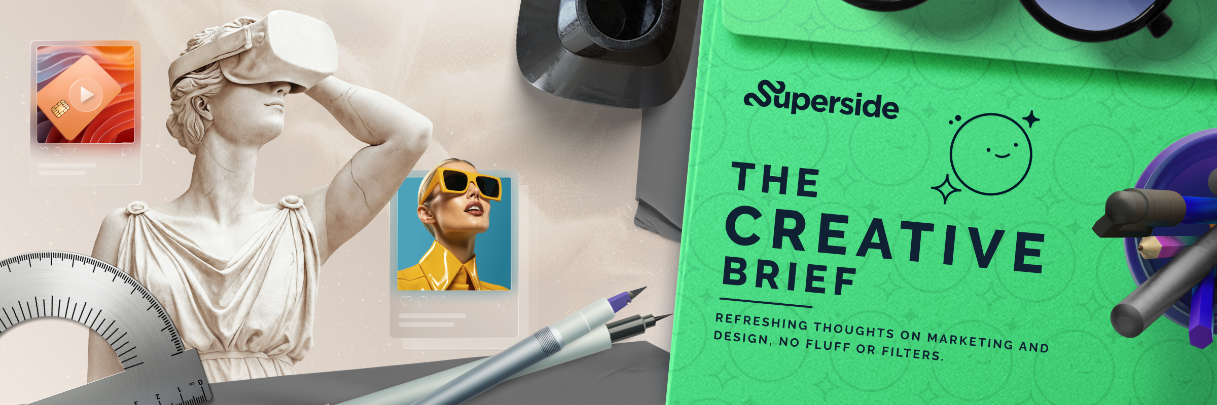
2. Tailor creative to your key persona(s). ๐Ÿ‘” What does your average reader's day look like? We're a bunch of designers and marketers talking to designers and marketers. You'll notice the banner up top reflects that.

3. Be simple. ๐Ÿ‘ถ Think of how you can communicate the vibe/message with as few elements as humanly possible. Especially considering how many recipients are reading on their phones. To that end...

4. Make it look good in all formats. ๐Ÿ’… The difference between an image viewed on a computer/tablet and a phone can be life or death for performance. Large or process-heavy images may look fine on your setup, but they may need retooling to come correct across the board.

5. Mix it up... a bit. ๐Ÿฒ Throw in a seasonal banner every once in a while, or change the aesthetic up to match a new campaign. Don't abandon the old branding, but skew 20 - 40% to keep things fresh.

>> See the examples


This Week in AI

Keep your UX ahead of the curve โ†ฉ๏ธ

Videos, copy and static images get all the airtime in AI conversations. But it's all for naught if the site they're showing up on (or direct to) is clunky or unintuitive. 

This week, read how UX experts are using AI to strengthen the digital backbone of their brands.

>> Read the blog


Meme of the week ๐Ÿ˜‚


From our community ๐ŸŽจ


Twitter dies... ๐Ÿค

...so X can live.

The struggling platform's most recent owner offered a heartfelt goodbye to its old brand, embracing a much stodgier aesthetic going forward.

>> Read the eulogy

No more Meta for enterprise ๐Ÿฌ

Here's hoping your workplace doesn't use Workplace.

Enterprise marketers, take note: Meta's enterprise communication platform is also hitting the dirt this week.

>> Read about it


If you've reached the end of this email, it's safe to say something about it's design helped keep you here. Was it the cute meme? The tasteful beige of the AI section?

No.

It was the italics. It is always the italics

โœจ Stay super,


David Wilson

Sr. Content Specialist

Superside | The better way to get design done